While reading about the beautiful Cartograph font I noticed that one of the illustrations was of a simple retro style chart. It was mostly black and white with dots and dashes. Could I recreate that look in a theme that could be used with real data in R?
Here’s how it turned out (all colors are customizable, see more examples below).
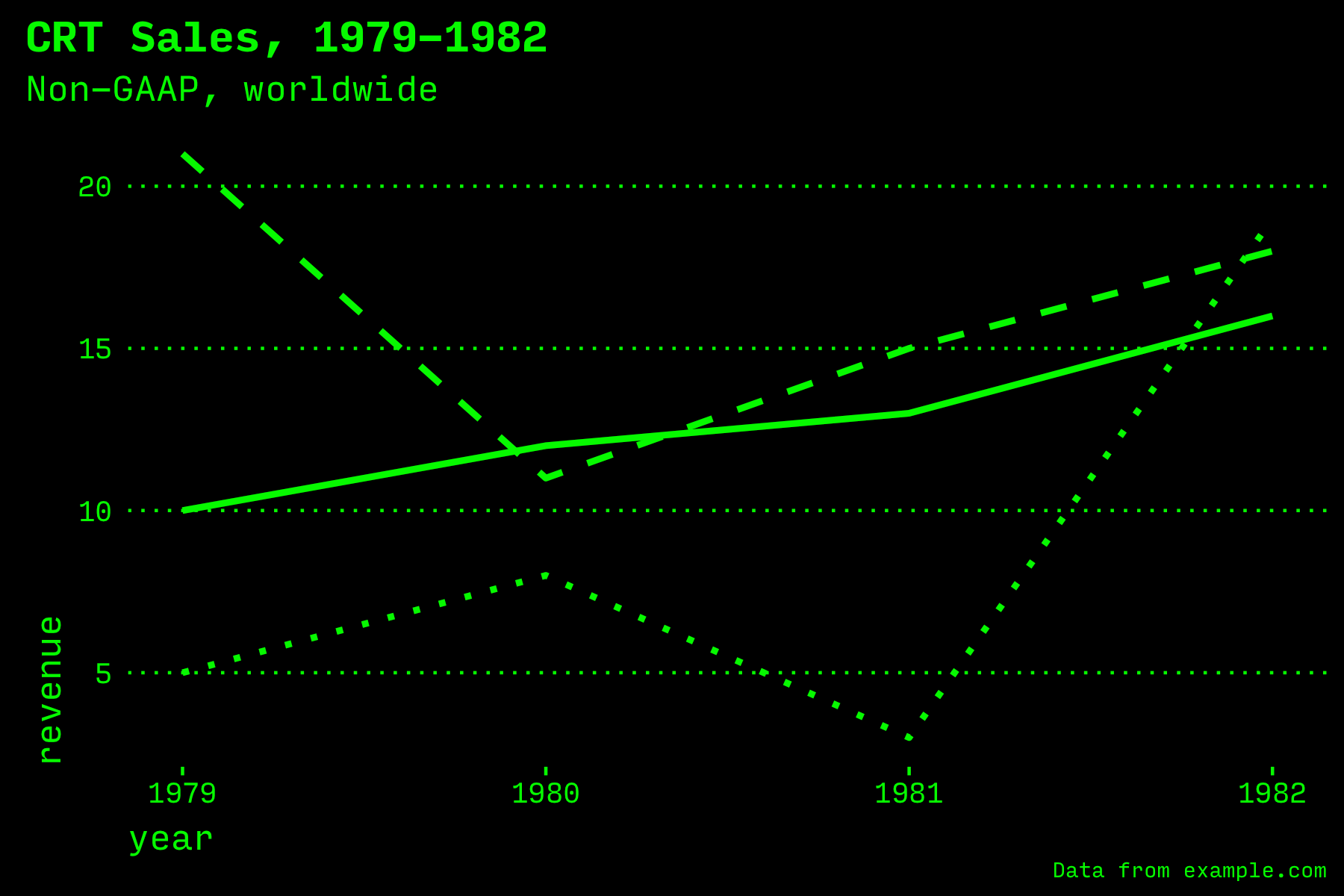
Green on black chart
NOTE: The InputMono font is free for personal use and looks great at all sizes for charts.
Quick Start
Install straight from the GitHub repo by running this command in code or in the R console.
install.packages("devtools")
devtools::install_github("topfunky/gghighcontrast")
Specify the gghighcontrast library in code anywhere you want to draw a chart.
library(ggplot2)
library(gghighcontrast)
Then add the theme_high_contrast() to any plot.
plot + theme_high_contrast(
  foreground_color = "white",
  background_color = "black",
  base_family = "InputMono"
)
You’ll need to set color when using geom_line or other drawing functions.
plot + geom_line(color = "white")
If you’re plotting more than one data set, see also the scale_linetype_high_contrast and scale_fill_high_contrast functions to create theme-specific dashed lines and greyscale fills for bar charts.
If you’re using the theme in an RMarkdown document, it will be especially convenient to set the theme globally as the default. Use the theme_set() method:
# In RMarkdown or any document where
# you're rendering multiple charts
ggplot2::theme_set(
  theme_high_contrast(
        base_family = "InputMono",
        background_color = "black",
        foreground_color = "white"
      )
)
Goals
I started with a few goals. While there are many ggplot themes, not many use a recent more modern looking feature where the background can fill the full canvas. And most are minor tweaks on the same visual style. I wanted to create something really different. And it would also be an opportunity for me to learn to write a proper R package that can be installed by anyone.
- Easy to use with a single font
- Easy to use with a black or white background and one color (no designer required…just pick a contrasting color)
- Dynamically build supporting shades (where needed, such as for bar colors)
- Works best with a line or bar chart but can also be used for
geom_pointandgeom_density, etc.
Limitations
- Works best with 1-3 data groups (but not many more)
- The original inspiration used retro style dot patterns for bar charts but this uses shades of grey
- It doesn’t work well with
coord_flip(horizontal bar charts)
Examples
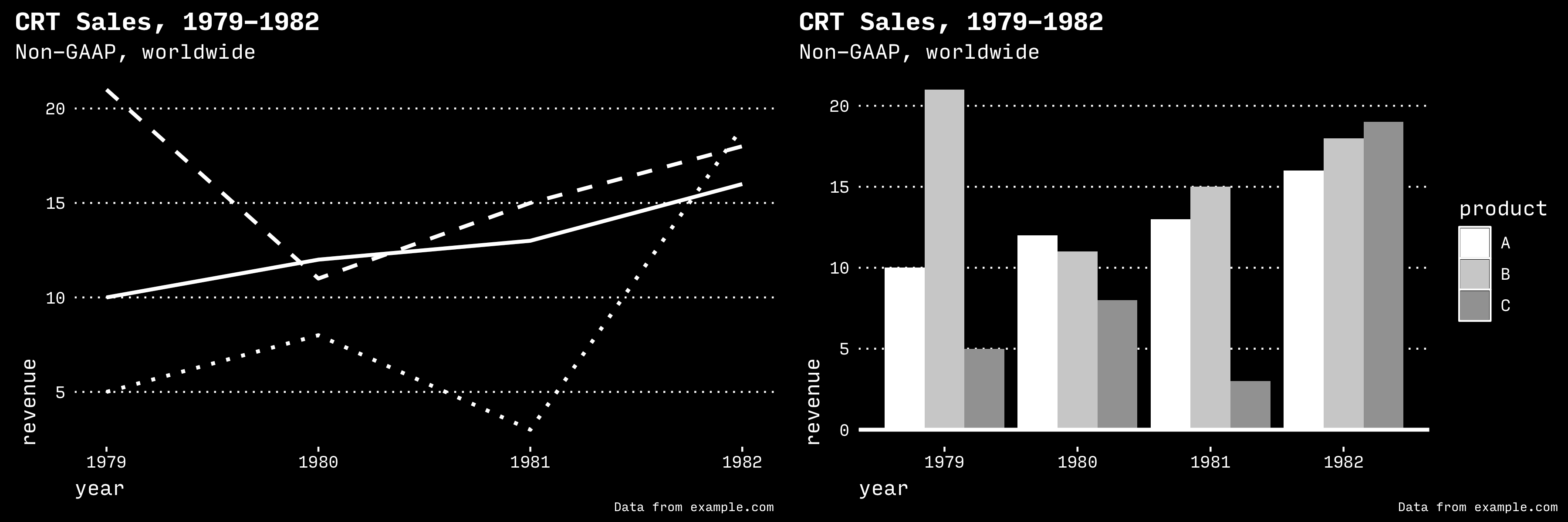
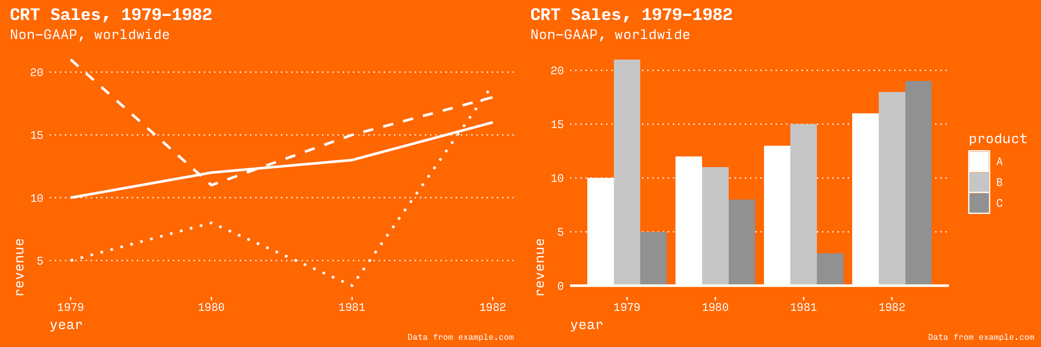
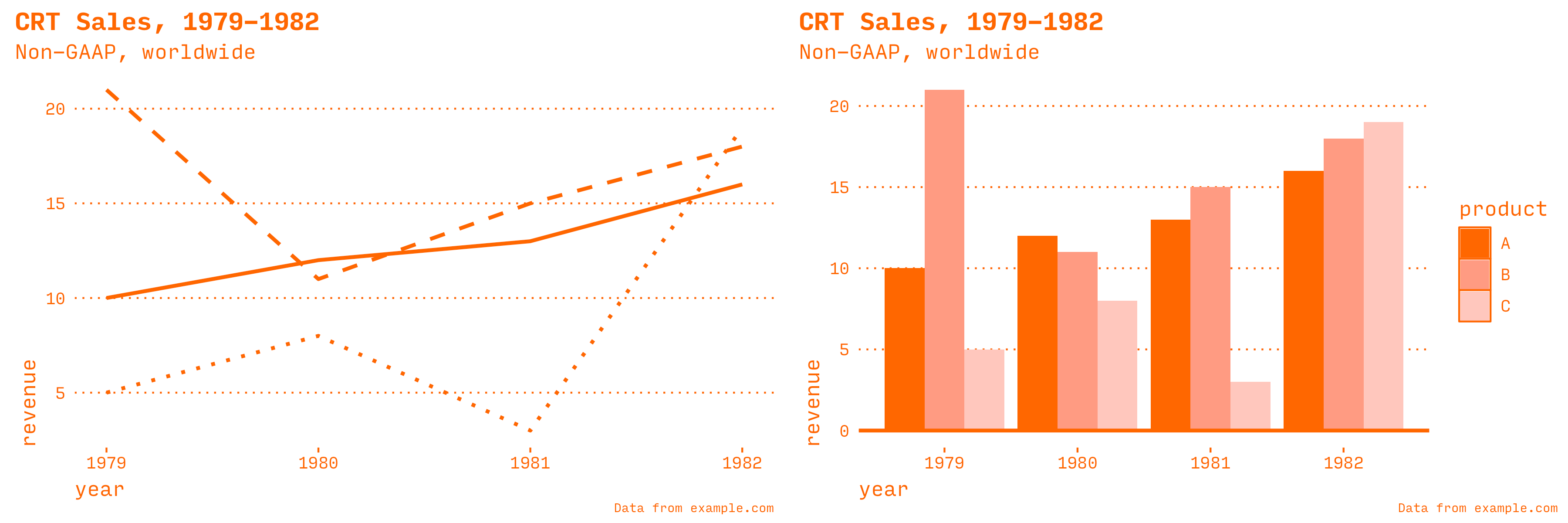
The theme works well with black and white (the default), with bright colors, or with a white background and any color for the foreground.
Significant customization is possible. Here’s a separate project where I started with the high contrast theme and then added images, other lines, and geom_rug at the top and bottom.
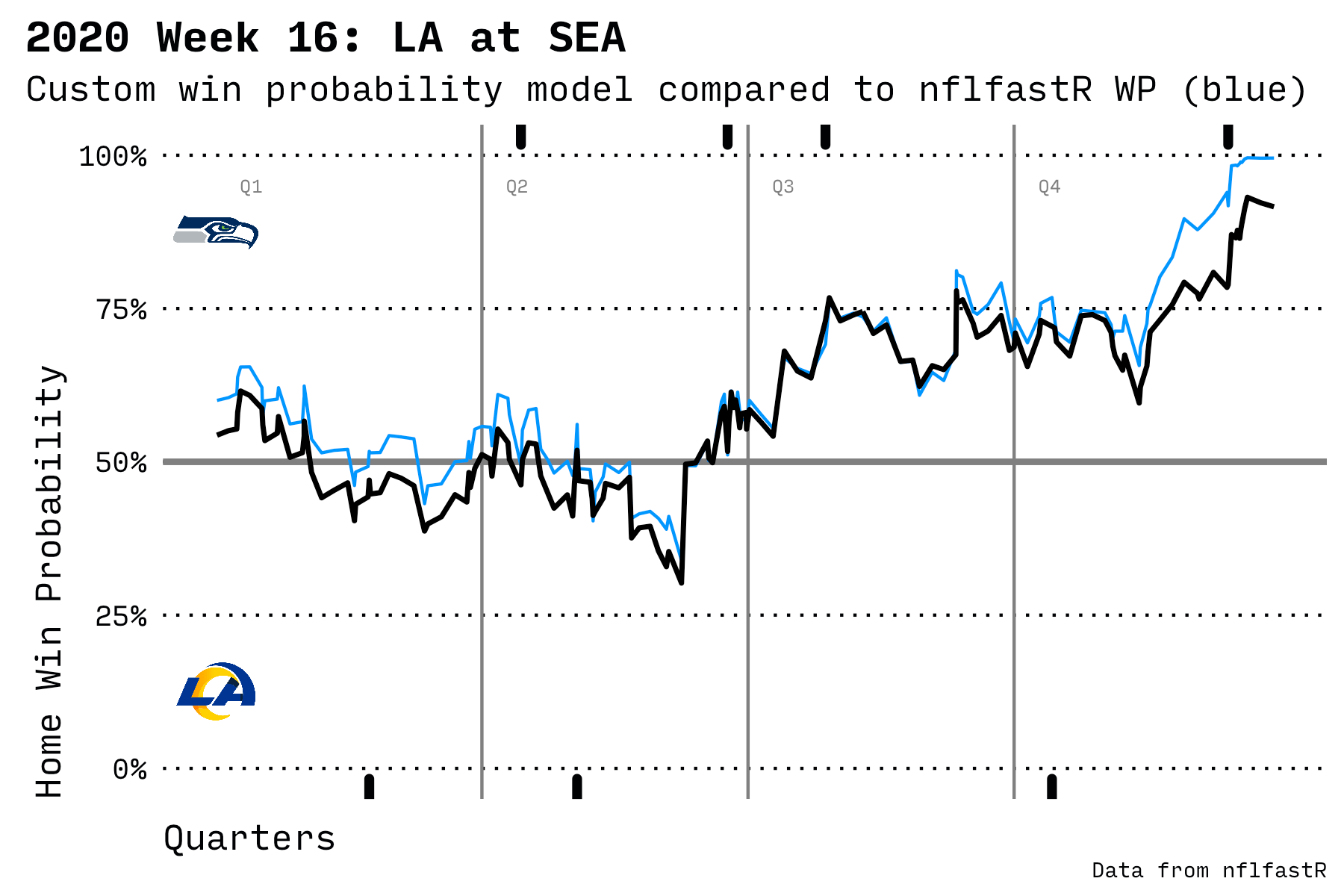
Win probability chart using high contrast theme
Detailed Code Example
For the full experience, here’s code to draw a line chart and a bar chart.
install.packages("devtools")
devtools::install_github("topfunky/gghighcontrast")

library(ggplot2)
library(gghighcontrast)
Define some data to draw.
data <- data.frame(
  year = c(
    1979, 1979, 1980, 1980,
    1981, 1981, 1982, 1982,
    1979, 1980, 1981, 1982
  ),
  product = c("A", "B", "A", "B",
              "A", "B", "A", "B",
              "C", "C", "C", "C"),
  revenue = c(10, 21, 12, 11,
              13, 15, 16, 18,
              5, 8, 3, 19)
)
Draw a line chart. I like to enclose any drawing code in a function so I can reuse it.
plot_line_high_contrast <-
  function(data,
           foreground_color = "white",
           background_color = "black") {
    plot <-
      ggplot(data,
             aes(
               x = year,
               y = revenue,
               group = product,
               linetype = product
             )) +
      geom_line(color = foreground_color,
                size = 1) +
      theme_high_contrast(
        foreground_color = foreground_color,
        background_color = background_color,
        base_family = "InputMono"
      ) +
      theme(legend.position = "none") +
      scale_linetype_high_contrast() +
      labs(title = "CRT Sales, 1979-1982",
           subtitle = "Non-GAAP, worldwide",
           caption = "Data from example.com")
    return(plot)
  }

p <- plot_line_high_contrast(data)
Or a bar chart.
plot_bar_high_contrast <-
  function(data,
           foreground_color = "white",
           background_color = "black") {
    plot <- ggplot(data, aes(x = year,
                              y = revenue,
                              fill = product)) +
      geom_bar(stat = "identity",
               position = position_dodge()) +
      geom_hline(yintercept = 0,
                 color = foreground_color,
                 size = 1) +
      theme_high_contrast(
        base_family = "InputMono",
        foreground_color = foreground_color,
        background_color = background_color
      ) +
      scale_fill_high_contrast(foreground_color = foreground_color) +
      labs(title = "CRT Sales, 1979-1982",
           subtitle = "Non-GAAP, worldwide",
           caption = "Data from example.com")
    return(plot)
  }
p <- plot_bar_high_contrast(data)
Tweaks
When drawing lines, set size = 1 (or greater) for a thicker line.
plot + geom_line(color = "white",
                 size = 1)
Bar charts look best with a solid line on the baseline (at zero). Draw a line at zero with geom_hline() to visually ground the chart.
plot + geom_hline(yintercept = 0,
                 color = foreground_color,
                 size = 1)
Resources
- GitHub repo for this high contrast theme
- Cartograph font
- InputMono font
- ggplot themes gallery
- DayGlo orange color
Design Notes: White on black can be painful to read but this post deserved high contrast colors. The background is a rich black: #010203.
The site is generated with Hugo and SCSS.
Other articles
-
Learning about prediction with real data
-
Three prescriptive and descriptive models
-
What it means to build a career in professional software development education