For quite a while I’ve been a huge fan of the statistics journalism publication FiveThirtyEight. But it’s not only for the data journalism, the thought provoking angles on otherwise easily ignorable events, or the commentary on their numerous podcasts. It’s for their web design.
Anyone who wants to publish data-heavy articles to the web has a challenge ahead of them. Screens are small and attention spans are smaller. I’ve spent a few years learning to use data analysis tools, but what interests me here is the way they’ve used plain old HTML, CSS, and JavaScript to communicate highly technical ideas clearly. But you might not notice everything they are doing if you only visit the site for a few minutes. So here are the five most impressive aspects of their design, engineering, and platform that I’ve been impressed with.
Designed for the audience
Typographical nods to spreadsheets, ledgers, and legal documents add personality without distracting from the data.
Ridiculously responsive
Everything from prose to tables to interactive projects scales down to the smallest mobile device screens.
Low tech design that communicates
Color and simple shapes pack quite a lot of information into not a lot of space.
Retina screens leveraged
When even more data density is needed, the smallest font sizes are used (readably) with the assumption of deployment to high resolution screens.
Web standards on a stock CMS
At the end of the day, it's all published on the old standard: WordPress. Engineering is put into the content and the front end display rather than a back end content engine.
Designed for the audience
The first time I surfed into FiveThirtyEight and saw the heavy use of monospace code/data fonts in places where no other publication would use them, I thought, “These are my people.”
At one point they used a monospace OCR type font for captions as well, but even now they show up on dates, bylines, and tags. It adds some personality to the site and shows that, even as much as they work to bring data analysis to the masses, they are still going to assume that the audience have arrived with a level of familiarity with code and numbers, or hopes to learn by visiting.
 Monospace fonts are used heavily, evoking a spreadsheet
Even the body font is just a hair off of Times New Roman that one might see in legal documents or as the default font in Microsoft Word. But instead of coming off as lazy, it communicates to me that they’re all business and aren’t going to let a typeface steal the story or distract from the numbers.
The footnotes are a creative touch. A click on the standard superscripted number reveals an aside or extra link inline without taking you away from the flow of reading. The superscript even turns into an x so you can close it back up again and continue reading.
 Footnotes are shown inline; they don’t break up the reading experience
Ridiculously responsive
You want to publish dozens or hundreds of data points to an educated audience, and you know that many of them will be reading on mobile devices. How do you accommodate the mobile screen without limiting the data you publish to desktop devices?
You use responsive web design; custom designs for large, medium, and small size screens.
It’s fortunate that the ascent of 538 as a website happened around the advent of web browser support for responsive design (a set of APIs for detecting the size of a browser window so that appropriate content can be displayed on it). The designers at 538 use it more productively than any other other site I’ve seen. It’s not just a visual design element; they use it to display more data to devices that can show it, and more relevant data to devices that can only show a few of the most important items.
Start with the full screen version of the NWSL soccer predictions. On the full desktop version, you get a dozen data points per team, plus color that communicates additional qualitative information.
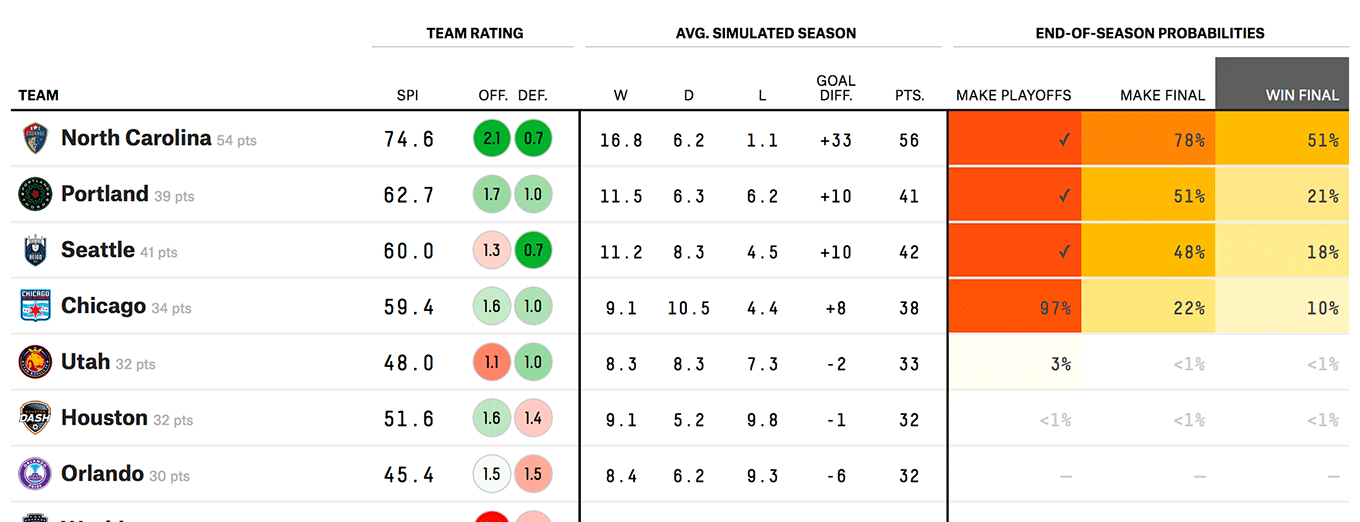 12 data points for each team, plus color
It would be impossible to display all those data points on a smaller screen while still making it readable. And most people who are viewing on a smaller device are probably content with a summary of the predictions. On a smaller tablet (below left), we only see three columns and four data points. Removed are the interesting but less crucial simulated season, offensive and defensive rating, and the probability that the team will make the championship final.
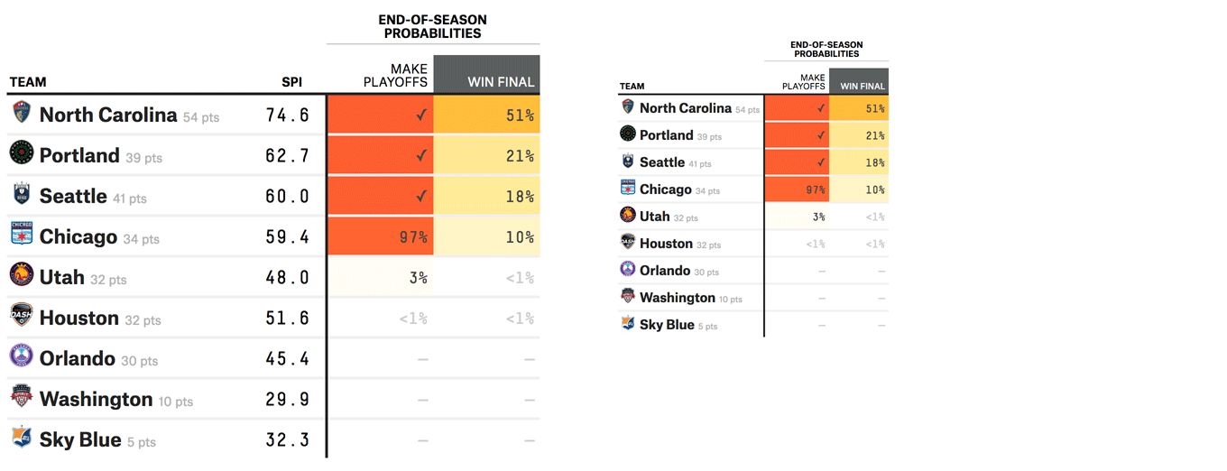 Projected wins
Launch an even smaller mobile screen (top right) and we lose the team’s calculated power index, seeing only the points they’ve achieved (from wins and losses), the probability that they will make the playoffs, and the probability that they will win the championship.
By using responsive design, the mobile user is treated as a valued visitor and is given a meaningful opportunity to peruse the data, even if we’re given less data than we could see on a larger screen. There’s a reason to come back either to mobile or to the desktop experience.
This example is clear to see, but they take it even further with interactive JavaScript-powered visualizations that often have a mobile experience which shows less data but is still interactive. As someone who works in product design and interactive experiences, I know that there must be someone at 538/ESPN/Disney who values both the front-end web experience and has committed to funding the hours needed to engineer and design those experiences. Impressive!
Low tech design that communicates
Even with the front-end web engineering skills that must exist in-house, they don’t lean on them all the time. In fact, many visualizations use the simplest features of HTML and CSS that any student learns in a CSS 101 course.
In the screenshots below we see circles and colors used to show a team’s offensive and defensive rating. On the left, darker green means better; white is neutral (within a threshold); pink means worse than average while deep red identifies the lowest performers.
Implementing this probably requires either a server-side dependency between markup and styling, or a client-side table renderer that both draws a number and applies a color to the background. Using color together with numbers is a well established technique and it’s used well here.
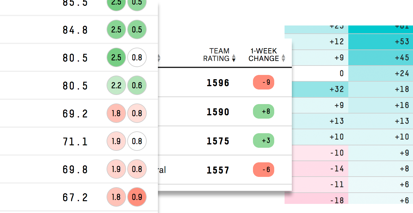 Shape and color communicates qualitative attributes of data
In the middle, a lozenge does the same thing with only red and green. On the right, cell color varies in intensity with the value of its data, making the outliers stick out and quickly identifying teams with a spread between two different metrics.
 No hamburger for you!
Usable UX also receives a nod. No mystery meat hamburger menu here (or kebab, bento, or meatballs). Just an obvious MENU in a box.
Retina screens leveraged
Earlier we saw how responsive design is used to eliminate less crucial information for mobile screens. Sometimes they use the capabilities of those screens by scaling down the font size and displaying text at 8, 9, or 10pt. Here we see full names, unabbreviated column titles, and data points all on our mobile device.
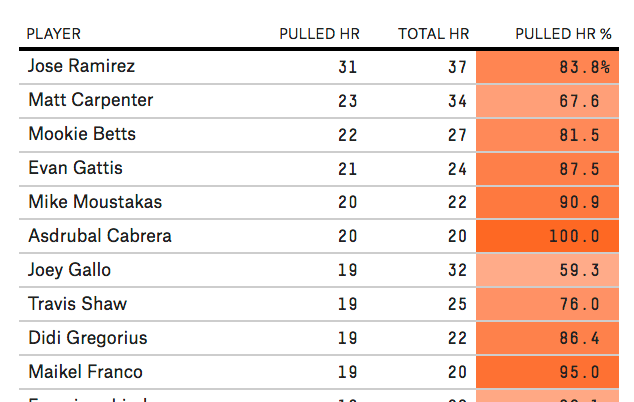 Using every pixel at hand
Web standards on a stock CMS
All this data formatting, styling, and visualization must require a healthy web stack. And don’t forget that this is a publishing organization that needs to keep on a regular schedule. But underneath, it’s all WordPress.
I wouldn’t have been surprised to hear that they had written their own CMS from scratch in order to accommodate their needs. And I’m sure there are at least a few custom WordPress plugins in the mixture. But the fact that they’ve been able to do all this on WordPress while focusing on the journalism and front-end visualization is pretty impressive.
Beyond that, they’ve also published code and data on GitHub so you can run the numbers yourself.
Other articles
-
Learn by doing, even before knowing why
-
More than lines of code, it's the mental approach that matters